The art direction on YOKOHAMA, the board game, stands as a testament to the meticulous work undertaken by our Art Director, Marie-Elaine Bérubé, and the talented illustrators at The Creation Studio. Here, they shed light on the creative process behind bringing the early Meiji era to life in the game.
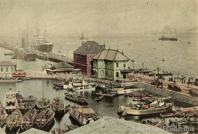
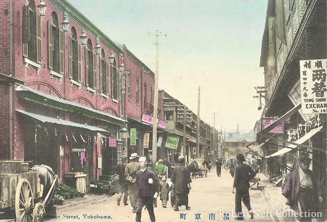
Before embarking on a project like YOKOHAMA, it’s essential to do extensive historical research to soak up the nuances of the time period. “This was a crucial step to portraying Japan’s Meiji era as accurately as possible,” Marie-Elaine affirmed, underlining the importance of a global understanding to capture the essence of the historical context.


A Conscientious Approach
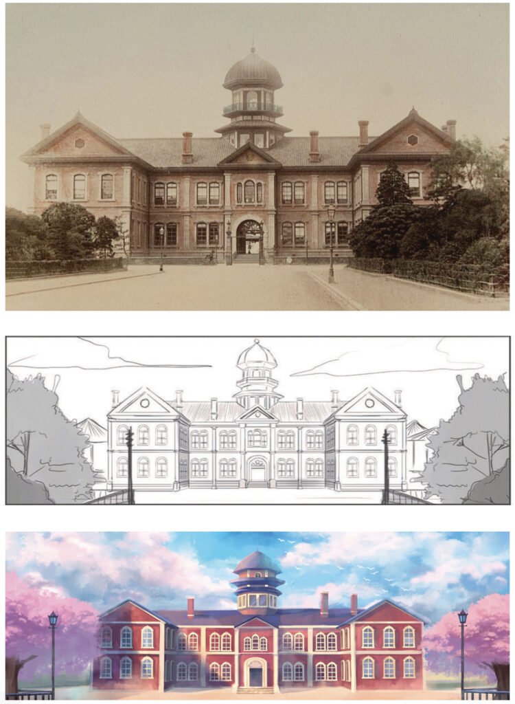
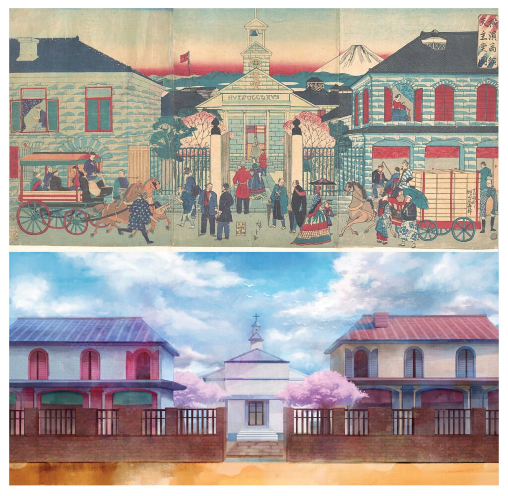
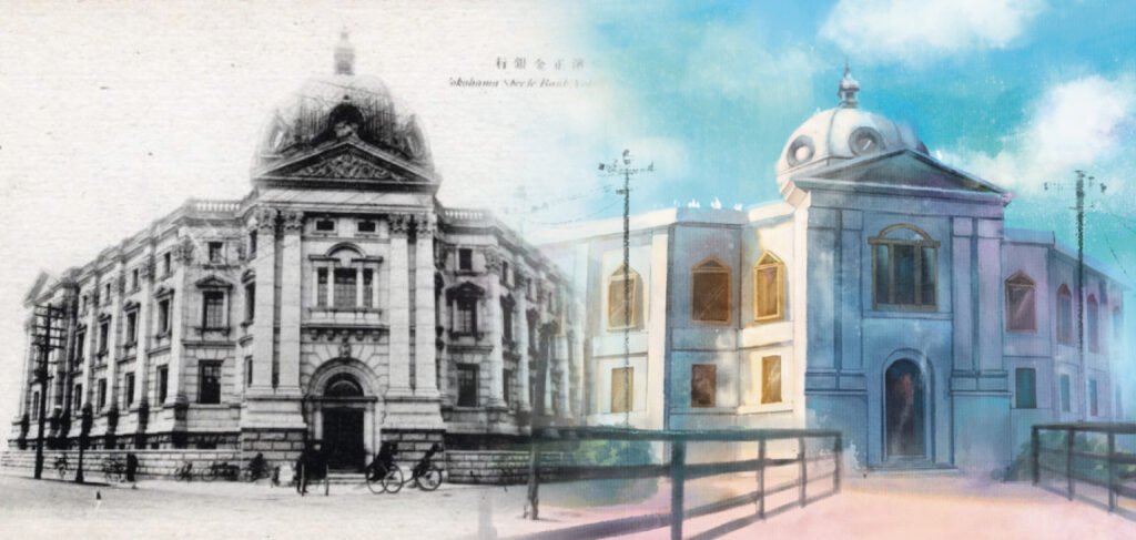
The journey from research to finished product involved a series of steps that reaffirms the team’s dedication to authenticity. Thorough data-gathering was the springboard for the process, followed by preliminary sketch work, paired with ongoing communication. Refining those sketches culminated in finalized illustrations, which were the result of careful planning, a steady sharing of ideas, and the establishment of clear standards early on.
One of the biggest challenges was identifying the appropriate look for the figures. Documentation from the reference period, circa 1868, indicated that this was a transitional step in Japan’s history as it gradually opened up to the Western world. For a certain time, both traditional Japanese dress and Western-style outfits coexisted and blended in Yokohama’s cultural landscape.
From Pen to Paper

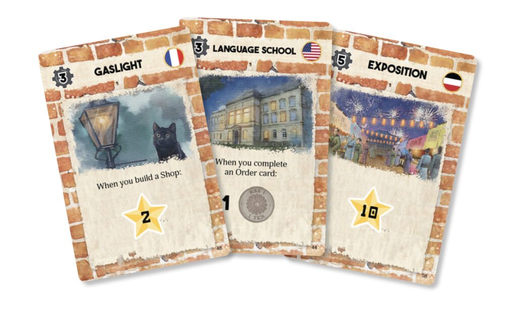
A notable aspect of the illustrations in YOKOHAMA is the use of pastel colors. The team delved deeply into the insights provided by their research, experimenting with various shades before settling on a tonal palette. Influenced by historical photographs and references, the general use of lighter hues aims to evoke a natural and atmospheric feel.
When reproducing locations, there is a constant balancing act between accuracy and creative expression. Drawing from period photographs, each artist injected their unique perspective into YOKOHAMA’s illustrations. Brush strokes, ink splatter effects, and other clever touches transformed the original scenes into alternative, visually captivating representations that retain the era’s essence.
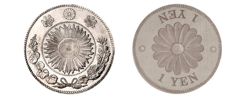
Despite the geographical distance, married with the challenge of not having experienced Japan firsthand, the team leveraged technology to bridge the gap. Online resources helped to recreate scenes and imbue the illustrations with authenticity, ensuring a vivid portrayal of the local customs and culture. As a general approach, the artists strove to mimic the look and feel of the era without attempting to create identical replicas. For example, when considering the Yen used in the game, the main inspiration was the chrysanthemum symbol found on the standard circulation coin of the time. When speaking of YOKOHAMA’s overall design, Marie-Elaine states: “We wanted this revamped version to combine a softened aesthetic with a modern appeal.”

– Marie-Elaine Bérubé, Art Director
“In order to confirm the accuracy of the visual cues and points of inspiration we gathered during our sourcing, we made sure to work in close collaboration with OKAZU BRAND, the original Japanese publisher of the game. The team’s main concern was to ensure consistency between artistic interpretation and a faithful representation of the Meiji era, and this was achieved through regular approval of images and illustrations.”
No Small Undertaking
YOKOHAMA required the creation of over 30 unique illustrations, all of which featured a distinctive watercolor style; an assignment that required months of dedicated effort. One of the hurdles for each individual illustration was to consistently render different watercolor effects designed to evoke a diverse range of emotions— a testament to the team’s commitment to delivering a visually dynamic and immersive experience.

“Our main source of pride in this project is that we were able to transpose the Japanese historical context into something close to an artistic masterpiece,” highlights Nic Lim of The Creation Studio.

Another important goal was to simplify the visual aspect of the game’s components to keep the table presence attractive while minimizing clutter. “There’s a huge number of components on the table during the game,” says Marie-Elaine. “We had to tweak the icons and illustrations in order to streamline the player experience, all while maintaining the historical feel of the era and keeping the overall presentation refined.”
A Tribute to a Classic Favorite
YOKOHAMA’s new edition honors everyone who contributed to breathing new life into this classic game. With its rich and evocative art style and reimagined components, YOKOHAMA stands as a collective triumph, seamlessly blending history with creative flair!